DAVID
GONZALEZ
Data Scientist
INTERACTIVE MARKETING & BUSINESS DASHBOARDS
Data Visualization
Project Overview
A collection of professional interactive dashboards created with Looker Studio and Power BI, designed to transform digital marketing and business data into actionable insights. These dashboards span campaign performance, engagement metrics, key insights, and advertising analytics with a focus on helping teams and stakeholders make data-driven decisions through intuitive visual representations.
Challenge
The challenge was transforming raw data into business-relevant insights, which required not only visualization skills but also advanced SQL expertise to create custom data feeds, join disparate tables, and develop complex calculated metrics that accurately reflected business performance indicators that standard connectors couldn't provide, while making the data accessible to both specialists and non-technical stakeholders.
Approach
For each dashboard, I started by identifying the key metrics and KPIs that would deliver the most value. I then designed data connections to relevant platforms, that would support real-time analysis. I designed custom SQL queries to extract, transform, and prepare data from various sources, creating efficient data models optimized for visualization performance. My advanced SQL skills allowed me to develop complex joins, aggregations, and custom metrics that standard connectors couldn't provide, such as cohort analyses and multi-touch attribution models.
Results & Impact
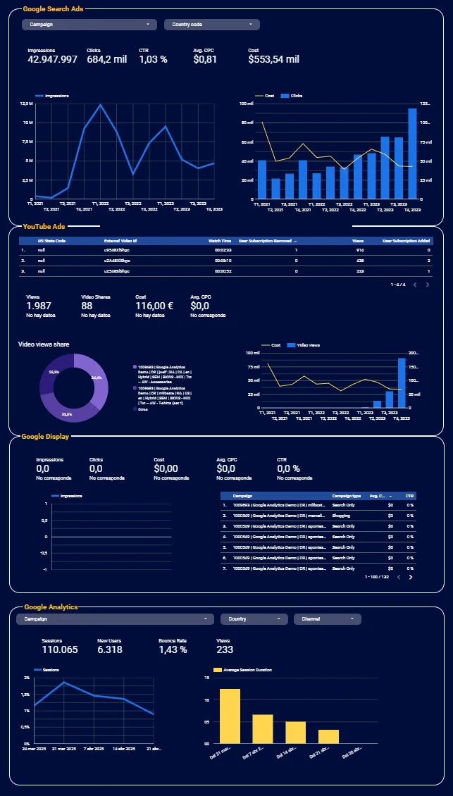
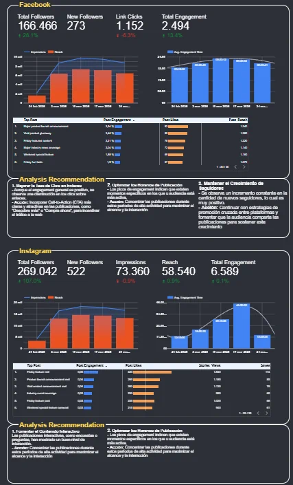
- Created specialized dashboards including Campaign-Group tracking, LinkedIn Ads performance, and engagement time analysis
- Reduced reporting time by 80% compared to previous manual methods
- Provided clear visualization of engagement metrics that led to content strategy improvements
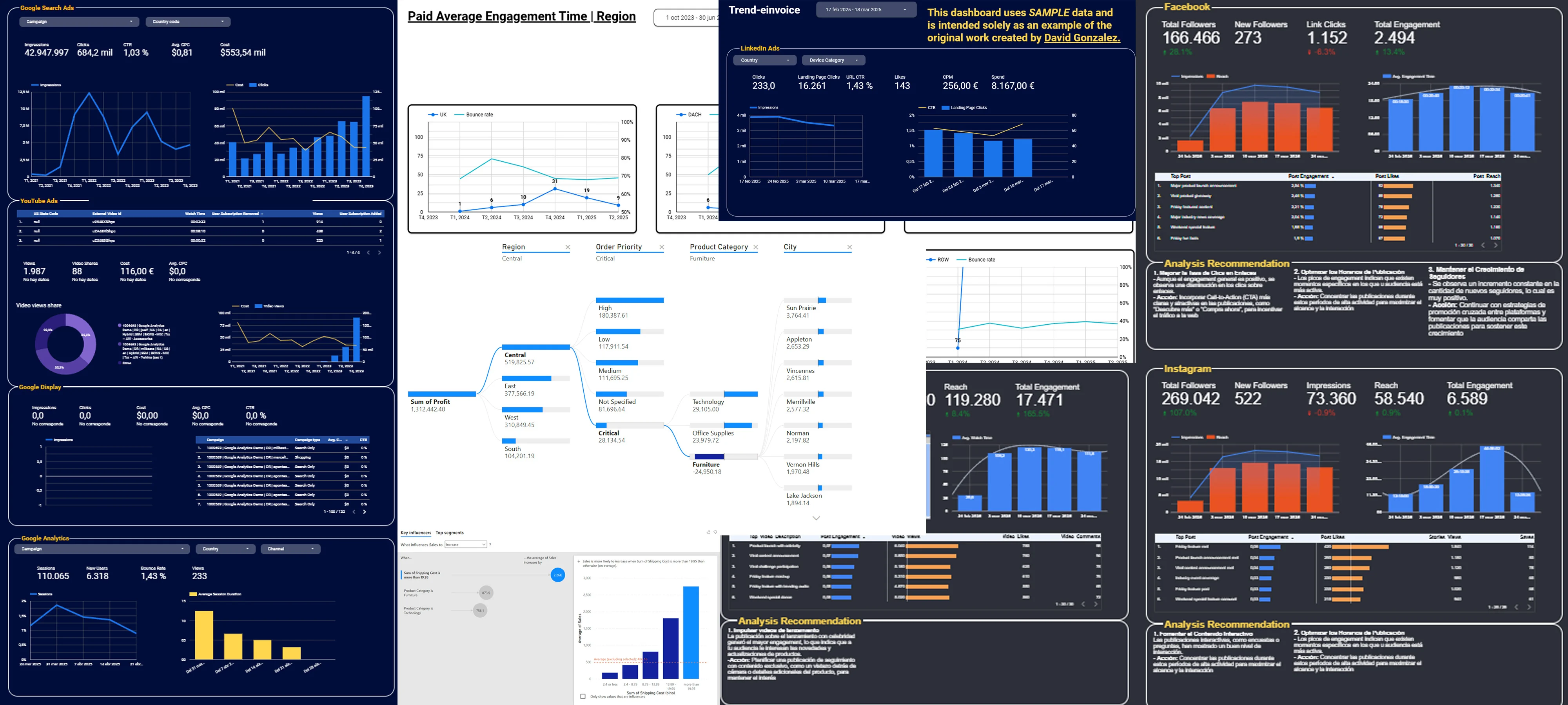
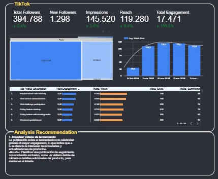
Gallery
Key Features
- Real-time data updates with automated refreshing
- Multi-dimensional filtering capabilities
- Custom branded design elements
- Cross-channel performance visualization
Lessons Learned
Developing these marketing dashboards taught me the importance of aligning visualizations with specific business questions and marketing objectives. I discovered that effective dashboards strike a balance between comprehensive data and focused insights, too much information can overwhelm users, while too little fails to tell the complete story.
Future Improvements
- I plan to enhance these dashboards by incorporating predictive analytics to forecast campaign performance and suggest optimization opportunities